Geo Map Chart
1 Introduction
The Map Chart provides the possibility to show your multidimensional data, on an interactive geographical map. At a glance, it gives you information on how the trading is going in a visual way thanks to markers’ size and color. Board based on your data range, automatically calculates markers’ sizing. Marker color can be set dynamically or based on your preferences. Data can be zoomed in and out until 20 different detail levels.

2 Board Geo-coding
To plot data into a map, you need a set of coordinates related to your markers .
Let’s consider for example to geo-locate your Customer by City for the cube Gross Sales dimensioned by Month, Customer and Product.
Let's pretend to have the Customer hierarchy as showed below:
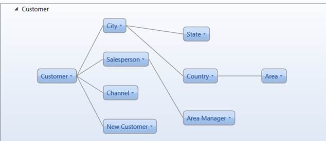
To plot data into the map, you need two different info-cubes dimensioned by City, one containing coordinate for Latitude and the other one for Longitude:
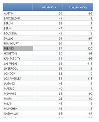
There are different free geo-coding services online, the list below provide some of them useful to get Latitude and Longitude:
http://www.findlatitudeandlongitude.com/batch-geocode/#.VBqPhVaWJFw
http://www.doogal.co.uk/BatchGeocoding.php
https://geoservices.tamu.edu/Services/Geocode/OtherGeocoders/
NOTE
Board Map object requires an active internet connection for maps download : the service is available on the http port 8080 that must be then open on the Company Fire Wall.
3 How to create and use a Geo Map Object
Click on charts icon and drag & drop into your screen the Map Object
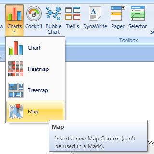
The ribbon bar additionally to standard chart features includes two ad-hoc settings :

3.1 Visibility
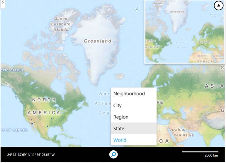
- Show Zoom Bar : It Enables preset zoom levels split by World, State, Region, City and Neighborhood
- Show scale : Enable the scale on you map
Image below shows both parameters into a map chart object
3.1.2 Map spot Color
It Provides the functionality to set color for the markers. This setting is set to all markers plotted on the map.
NOTE
Markers’ color can change dynamically by using alerts into your block, please refer to the page below:
3.2 Layout settings
Right click on the object to open layout and insert Data , Latitude and Longitude cubes.
Setup the Axis accordingly to the Markers and Markers Categories you identify.
Base on the Entity by row we can have :
- Standard Data Set : Single entity in row. The value is shown in the marker form. The position ig given by the Longitude and Latitude info-cubes
- Clustered Data Set: two entities in row. Data points are clustered together and a tile containing their counter is shown. The position of the tile is given as an average of the data points Longitude and Latitude info-cubes.
NOTE
You can use up to 2 Entity by Row
No entities by column are admitted
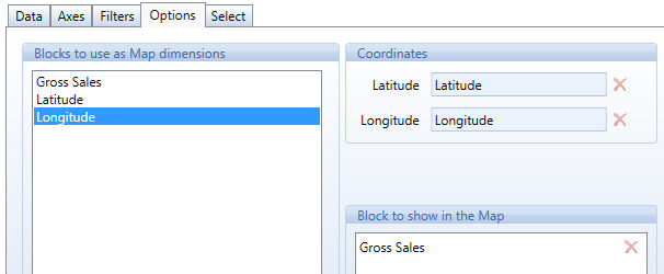
Click on the option tab and drag and drop the Layout blocks. Configure Coordinates Cubes to setup the position of the marker, the "block to show in the Map" to size the marker and the "block for series color" to alert code the marker.
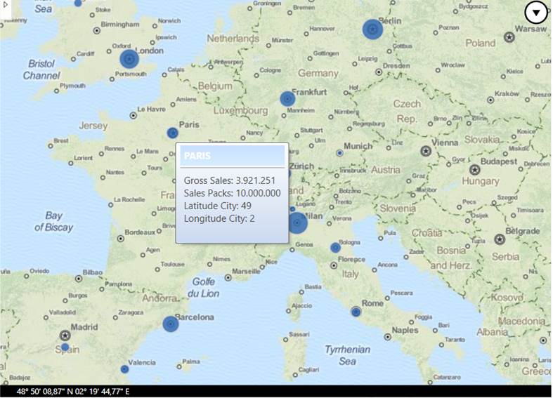
The Map object is prompt , you can zoom in -out and visualizes data on mouse overing the markers.
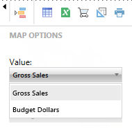
The sliding tool bar gives the possibility to change your data series and color coding on the fly or to prompt the Data View Spreadsheet.
Overing the mouse over the Map Bubbles, Board highlights those measures that have been used to determine Radius and Color